


Showing top 0 results 0 results found
Showing top 0 results 0 results found
A majority of businesses feel that generating leads is one of their top challenges, which isn’t much of a surprise considering:
- 61% of companies run 5 or less landing page tests per month
- 48% of landing pages contain multiple offers
- 75% of marketers struggle with optimizing landing page copy
- Only 16% of landing pages are free of navigation bars
These numbers indicate that marketers aren’t taking full advantage of post-click landing pages as they should be.
Post-click landing pages (standalone pages that prospects land on after clicking an ad or search result) are the best marketing asset to create a great first impression and generate conversions -- but only if designed correctly. If your landing pages aren’t optimized for conversion, they could be a liability in your marketing funnel instead.
Fortunately, there are some landing page best practices to help you generate maximum results. This article will take a closer look at five of them.
1. Message match
A great user experience when clicking an ad starts with message match. To do this, coordinate your ad content (search, display, social media, etc.) with your landing page content. This is where you match headlines, imagery, color scheme, etc. to let prospects know the page is relevant to the ad and to reinforce the message in their mind.
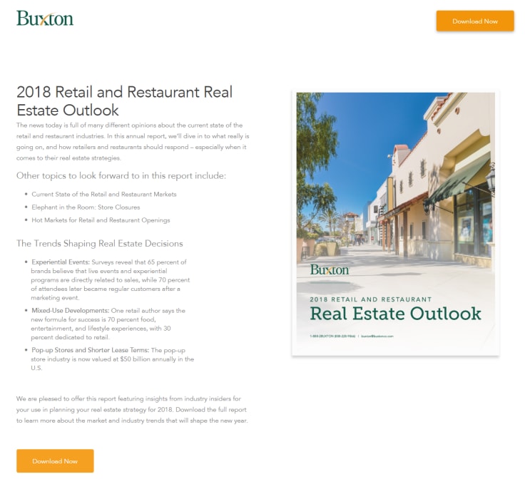
Buxton perfects its message match between display ad and landing page below. First, the ad that promotes their annual real estate report:
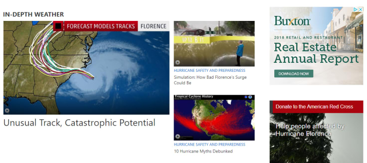
Then, the landing page where prospects can download the report:
Strong message match builds trust, while lack of message match can feel like false advertising. Be sure your landing page delivers what your ad promised, and provide a consistent user experience from start to finish so visitors are more likely to fulfill your conversion goal.
2. Bulleted copy
Visitors don’t come to your page to read; they come to find a solution to their problem. In fact, lots of copy and block text actually intimidates online users, and most people tend to ignore copy when there is too much.
To keep people engaged, avoid using excess copy and rely on bullet points instead. Bulleted copy draws attention to key takeaways, which is ideal for skimming visitors who don’t want to read every word. It eliminates the need for blocks of text and helps visitors scan content quickly to evaluate your offer.
Comcast Business demonstrates how to do this by showing their main benefits in bulleted format:
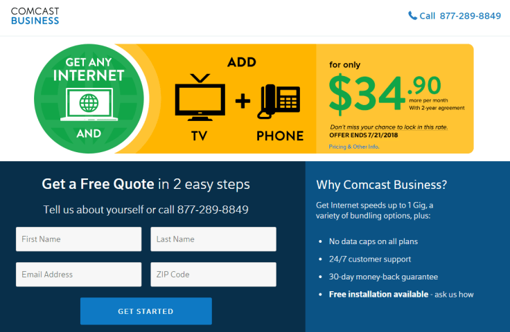
Formatting copy with bullet points declutters the page, increases engagement, and ensures your most important content isn’t ignored. As a result, visitors feel less intimidated and are less likely to bounce from the page.
3. Whitespace
White space, aka negative space, is the blank space between and around landing page elements. This space doesn’t necessarily have to be white, as long as it is empty and directs attention to other page elements.
This white space web design technique subconsciously forces visitors to focus on the most important elements: headline, form, CTA button, imagery, and social proof. It reduces clutter, and with nothing else to draw their attention, people focus on what you want them to.
Along with eliminating clutter, white space also serves several other functional purposes:
- Increased readability
- Better design hierarchy
- Pleasing visual experience
- Improved focus
- Greater comprehension of the content
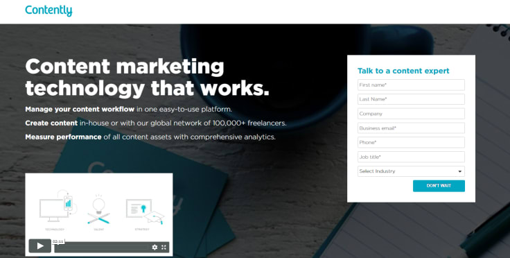
For this example, notice how Contently’s landing page form is separated from everything else so you can’t help but notice it:
4. Relevant imagery
People can spot a cheesy stock photo a mile away. That said, landing page imagery can assist with lead generation when used correctly. So, when including images make sure they are relevant and add value to the page. Because in the end, your goal is to persuade people into converting any way you can.
Among other benefits, landing page images help:
- Explain what your product does
- Showcase your product with screenshots
- Add human appeal to your pages
- Empathize with your visitors
- Make your page more aesthetically pleasing
Hootsuite is a great example with their landing page imagery by showing a preview of their social media marketing solution:
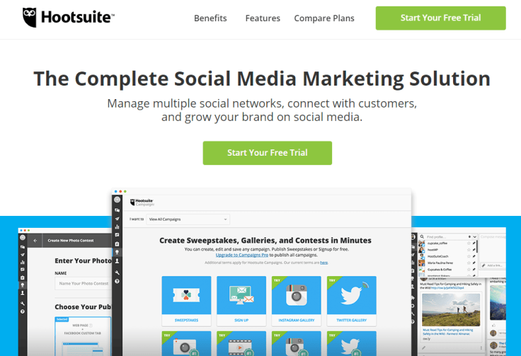
By including product screenshots, Hootsuite is able to highlight a few of their features and showcase the platform as a complete social media marketing solution. Had they opted for a stock photo or something else, they may not generate as many free trials.
5. Optimized form appropriate for the funnel stage
The landing page form is pivotal for converting leads, so it’s imperative that you design it right. Too long, and the form can intimidate and deter prospects from completing it. Too short, and you may end up with an overwhelming number of unqualified leads. What you need to do is optimize the form based on the marketing funnel stage the offer resides.
At the top of the funnel, maximizing lead gen is the priority, whether they’re qualified or not. Since short forms typically result in more leads, fewer fields are needed. Request just enough information (like name and email) to contact and nurture them down your funnel. At this stage, common TOFU offers include educational resources such as ebooks and tip sheets.
In the middle of the funnel, prospects are in the consideration stage of the buying process. Now your landing page should explain why your product or service is the best solution and how it will solve their problem. Since you want leads to be more qualified at this point, longer forms are more appropriate. Here, common MOFU offers include webinars and white papers.
At the bottom of the funnel, leads are in decision mode on who to buy from. Since they're more educated and have evaluated all options at this point, you can request more information. Longer forms in the decision stage (often broken up into multi-step forms) ensure your leads are sales qualified. This is why it is common to see product demos, consultations, and free trials as BOFU offers.
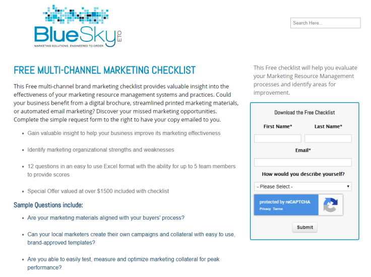
In this example, BlueSky only requires four pieces of basic information to download their multi-channel marketing checklist:
Implement these best practices on your next landing page
When designed properly, landing pages are a digital marketer’s best asset to convert prospects into leads. The key thing to remember is to design with the user experience in mind so people have no other choice but to convert.
Enjoy maximum conversion rates with all of your marketing campaigns by following these best practices. Not only will they help provide a quality user experience, but will also benefit your lead gen efforts in the process.

Get a glimpse into the future of business communication with digital natives.
Get the FREE report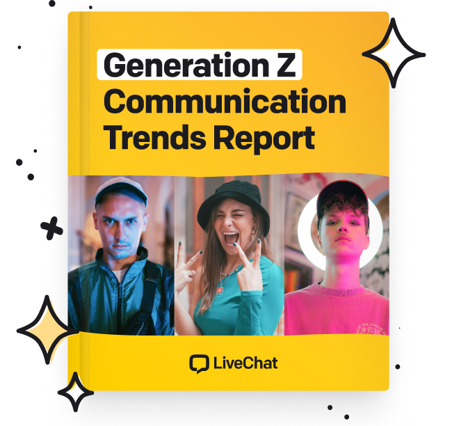


Comments